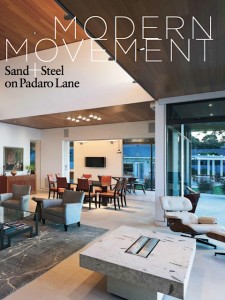
 ON A SANDY STRIP OF LAND WEDGED BETWEEN THE ROAR OF THE OCEAN and the equally commanding roar of the freeway, cottages and castles jostle amid the towering eucalyptuses where the sensuous curve of the coast beckons. Resonating in fact, all the way to Wisconsin, luring one modern art-collecting couple to reply. For good.
The owners commissioned award-winning designers Keith Rivera of B3 Architects and Laurie Romano of Arcadia Studio Landscape Architecture to deliver a modernist home that embraces the California-centric disciplines of midcentury masters Richard Neutra and Rudolph Schindler. The structure’s geometry—contrasted by neighboring wind-washed board and batten retreats—unfolds through intersecting right angles, squares, and forms defined by light, to say nothing of the 360-degree treetop, mountain, and ocean view.
With organically hued interiors by Santa Barbara-based Dana Berkus, the team realized the retiring couple’s vision for a new home and vacation hub for their children, grandchildren, and cold-weather friends.
It’s pretty daring to place this modernism moment on a street traditionally lined with shingled cottages….Keith Rivera The owners are particularly enamored with the curve of the coastline here, so it was a conscious decision on their part. They said, “We’re going to build a new house and it’s going to be modern and completely different than anything previously in our lives.”
I love the Mondrian-like wall surrounding the courtyard, creating geometry and light play by juxtaposing ipe wood, glass, and plaster. Keith Rivera The composition of this wall came about because of the owners. Originally, there was going to be a big plaster wall as a backdrop for some specimen planting, but the owners thought that instead, it might be a nice location to have something a little more visually playful than the rest of the house. Laurie Romano And we needed a usable space for entertaining, so we created “area rug planters” with bromeliads and mondo grass for a quiet space.
A quiet place created through choice of materials and a palette of sage, sand, and filtered white? Keith Rivera The architectural vocabulary of the materials’ colors initiated the whole concept. Out of the durable materials idea, we went with a standing-seam zinc roof with a green color, which we continued in the metal pieces inside—the stair and the bridge. One of the owners’ desires was for the house to be a neutral backdrop for them and the belongings inside. The tan limestone floors, bamboo casework, ipe-clad exteriors, plaster, quartz stone—all are simple materials but detailed very precisely and elegantly.
With so much structural glass, how did you address energy efficiency? Keith Rivera The idea was to fill the house with light, hence the clerestory windows surrounding the courtyard. It does two things: We get balanced light and air flow. There’s no air conditioning, you get ventilation by convection. And because we were so efficient with the building envelope, the house exceeds the state’s energy requirements by 50 percent.
You’ve said the owners were the ideal clients, but there must have been some design concepts that were met with more than a little resistance. Laurie Romano The reflecting pool. At first, it was hard for them to understand its purpose. It brings the ocean in when you’re sitting down, and you also have a sculptural piece that is active and bounces light under the eaves. We developed it when the house was under construction. We actually set up chairs on the concrete slab and set the level of the four-sided infinity edge within the owner’s sight lines. The surface material is porcelain tile made to look like Corten steel—it was a great find.
As you were designing the back terrace, wasn’t there a bluff line you needed to contend with? Laurie Romano There’s a geologic setback for bluff erosion, so it limited where the terrace could come to the water. The compromise was to install the concrete pavers below, adding livability and extending the indoor/outdoor part of the house.
The gardens seem to have several different microclimates. Laurie Romano The entrance and courtyard are a little more lush and tropical than the planting in the rear of the property, which is more arid with grasses, agaves, and natives. We left some existing plants—junipers, palm trees, and protea—then carved a path leading to the beach and a little bench accented by salvias and grasses, where the husband likes to battle with the gophers.
You have really dovetailed regional traditions with modern aesthetics—the work of midcentury ranch architect Cliff May comes to mind—yet in a totally 21st-century way. Keith Rivera The California rancho tradition of enclosing space with buildings to create courtyards—Cliff May recognized that by using modern materials. I think what modernism did was take that tradition and make it of our own time, and I hope that’s what we’ve done with this house.